Here, maybe this can help clear up the confusion:
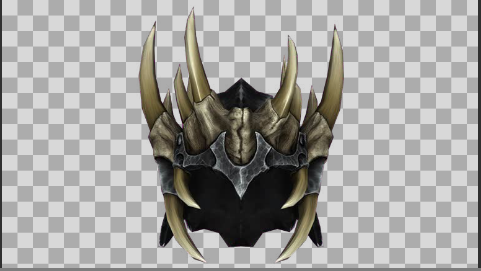
Let's say that I'm starting out with an image of the Jagged Crown from Skyrim, with a transparent background.
At the beginning, the image should look like this:
Now, if I added a “border” to it, it would suddenly look like this:
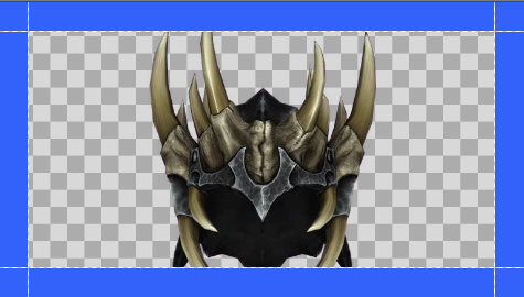
However, I want the outline to conform to the shape of the image, not simply to be a solid 16:9 rectangle.
The “Shadow” effect (which I called “drop shadow” in the OP) will conform to the shape of a transparent image. Applying some blue shadow to this image causes it to look like this:
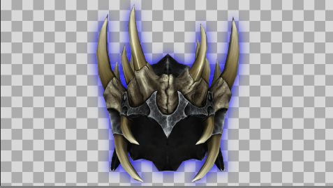
However, that is blurry. I want my outline to be solid, not blurry.
I could turn the blurriness down to zero (the default value is 10.000). But if I do that, the shadow appears to disappear completely.
I can assign a “distance” of 0.01, but then it looks like this:
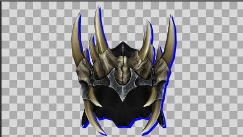
The shadow only appears on one side.
I can then add a second shadow, with an angle of 180 degrees so that it shows up on the other side. But then it looks like this:

Ok, that just looks like complete ass.
What I ideally want is something like this:
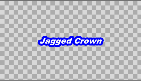
Notice how the blue outline is a solid color. It conforms to the shape of the letters, rather being a rectangle, and it isn't blurry. It's as thick or as thin as I want it to be, and it's applies uniformly on all sides.
When I'm typing text using Ctrl+T, I can get this outline around my letters quickly and painlessly by using this feature:
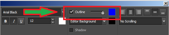
However, I would like to also have that feature for objects that have transparent backgrounds as well.




